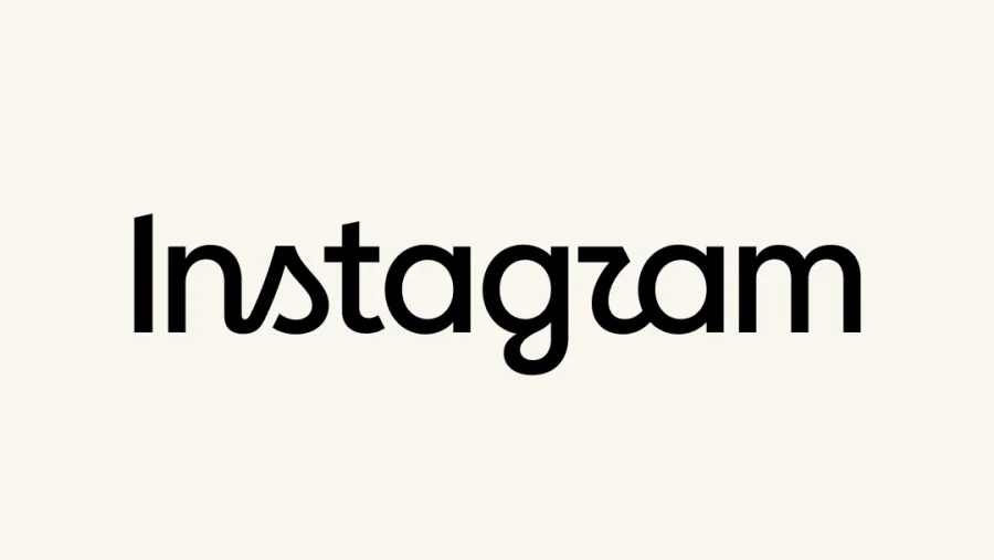
Instagram's logo just got "leaner and more modern." It also looks exactly like the kind of frictionless, soulless design the internet now calls AI slop — and the response has been anything but polished.
A logo refresh nobody asked for
Instagram unveiled a refresh of its wordmark, packaged with the usual corporate platitudes these announcements always carry. The new mark is cleaner, smoother, and — critics argue — utterly without character.
The timing is telling. Just as AI-generated visuals flood feeds, the platform's own identity appears to have adopted the same sterile aesthetic.
What "AI slop" actually means here
"AI slop" describes content that feels generated rather than crafted — generic, derivative, optimised to the point of emptiness. For designers and everyday users alike, the new wordmark hits every note: the visual equivalent of an apology written by a chatbot.
It is not that the logo is broken. It is that it says nothing at all.
What Instagram says about the new wordmark
Adam Mosseri, Head of Instagram, called the refresh "leaner and more modern, with references to the original and the simplicity and craft that's always made it Instagram."
Sure, Adam. Simplicity and craft are definitely what everyone thinks of when Instagram comes to mind.
Instagram is not alone in the bland rebrand era
The platform joins a long line of tech companies flattening their identities into interchangeable minimalism. The new wordmark looks less like a brand with heritage and more like the default output of an image generator asked for "modern social media logo."
What's confirmed versus what's still opinion
Confirmed: Instagram refreshed its wordmark, and Mosseri used those exact words to defend it. What remains opinion — though a widely shared one — is the charge that the design embodies AI slop. No official statement has acknowledged the criticism so far.
Why the backlash matters to Instagram
Instagram remains one of the most culturally influential apps on the planet. Its identity shapes how hundreds of millions of users perceive the platform. When a redesign feels like cost-cutting dressed as craft, it chips away at the emotional connection people have with the brand.
A fair hearing: the case for the redesign
Not everyone hates the update. Minimalism is a legitimate design philosophy, and simpler letterforms genuinely improve legibility across small screens. Some backlash is also simply change aversion — humans instinctively resist even small tweaks to familiar objects.
The AI sameness problem spreading through tech
This controversy is part of a bigger conversation. As companies rush to adopt AI tools, their outputs increasingly resemble one another. When every brand is optimised for engagement metrics, they begin to look like they were all generated by the same algorithm.
How to judge the new logo for yourself
Designers should compare the old and new wordmarks side by side before declaring a verdict. Users can expect the refresh to appear gradually across the app. And brand teams watching this unfold should take notes — this is what ignoring craft looks like in the age of AI.
Where the new identity goes next
The wordmark will likely roll out quietly across the platform in coming weeks. The open question is whether the criticism fades into background noise — or becomes a case study in why "simplicity and craft" cannot be faked by a prompt.
Our Take
The wordmark debate is really about trust. Users can smell when a product is designed by people versus defaulted by machines. An outcry over a letterform may seem trivial, but it signals a larger fatigue that tech companies ignore at their peril.
Frequently Asked Questions
Why is the new Instagram logo being called AI slop?
Critics say the refreshed wordmark looks generic, soulless and algorithm-generated — exactly the visual traits associated with "AI slop" content that floods social feeds.
What did Adam Mosseri say about the new Instagram logo?
Mosseri called it "leaner and more modern, with references to the original and the simplicity and craft that's always made it Instagram."
Has Instagram changed its branding before?
Yes. Instagram has refined its logo and wordmark multiple times over the years, with each change drawing some degree of user pushback.
When will the new Instagram logo appear on my phone?
Branding updates like this typically roll out gradually across the app and its marketing materials, so users should expect to see it in the coming weeks.
[NEWS_SCHEMA] {"@context":"https://schema.org","@type":"NewsArticle","headline":"Instagram's New Logo Is the Face of the AI Slop Era","description":"Instagram's refreshed wordmark is drawing fire as the 'perfect embodiment of AI slop' — generic, corporate and soulless. Mosseri defends the redesign.","image":"","datePublished":"","dateModified":"","author":{"@type":"Person","name":"Digital Culture Desk","url":"","sameAs":[]},"publisher":{"@type":"Organization","name":"","logo":{"@type":"ImageObject","url":""}},"mainEntityOfPage":{"@type":"WebPage","@id":""},"articleSection":"Technology","keywords":"new Instagram logo AI slop, Instagram wordmark refresh, Adam Mosseri"} [SOURCES] Original Story: The new Instagram logo is the perfect embodiment of AI slop — Source article